With India’s dessert industry growing at nearly double digit CAGRs, standing out is no cakewalk. DBS Ventures wanted to create an omni-channel dessert cafe. But in a world where cafes and cake shops are multiplying by the dozen, how do you build something that people don’t just visit but fall in love with?
Enter P.U. Dingding—born from the union of two contrasting co-founders and brothers in arms: pastry chef Nakul Kulkarni, and coffee curator and farmer Aiyappa KT. The brand was envisioned to be a warm and unique space that brings joy and an irresistible dopamine rush. Think lazy Sunday afternoons chilling with friends and family. Singing loudly. Swapping stories. Gentle squabbles. Insider jokes. Stealing the last bite of cake. Living the good life.
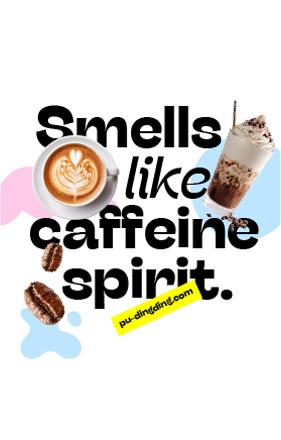
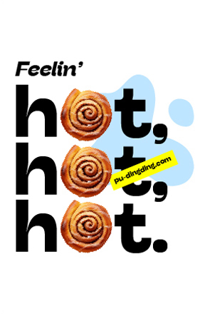
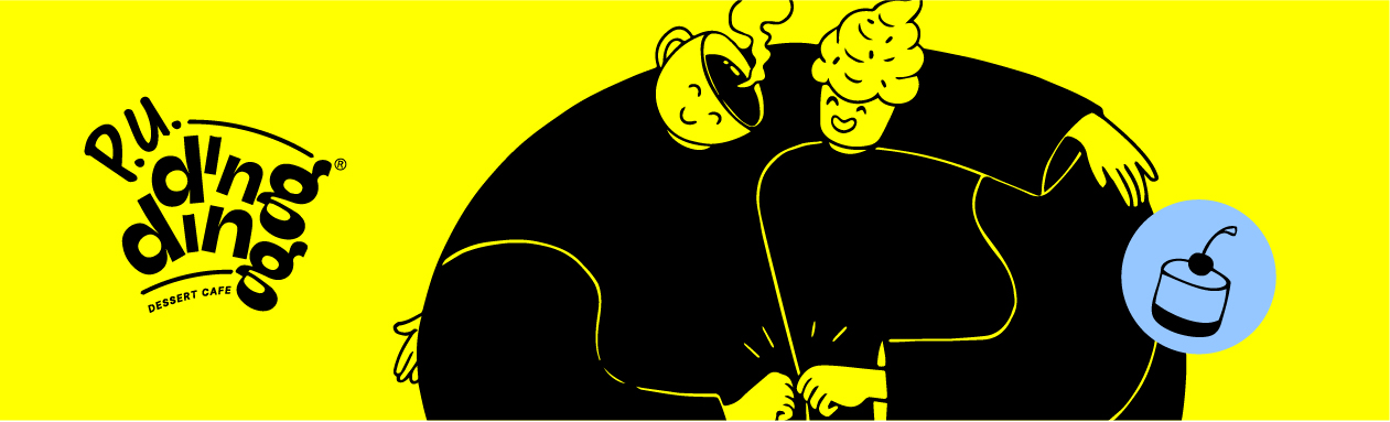
The name P.U. Dingding is a playful misspelling of ‘pudding’ with a twist. ‘Dingding’ evokes the sound of a bell, a game show win or an ice cream truck jingle—to cue feelings of joy and indulgence. The name immediately conveys fun, lightheartedness and an invitation to play.
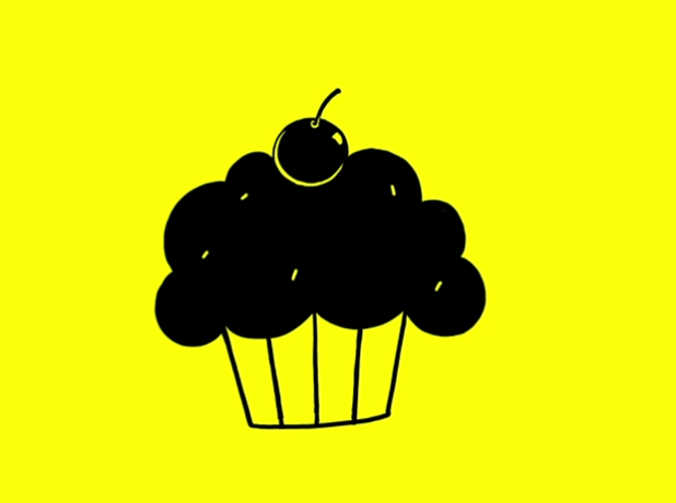
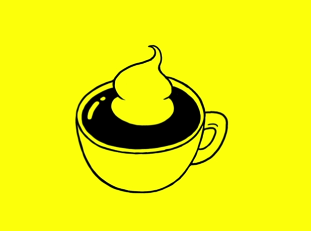
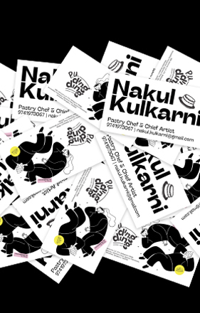
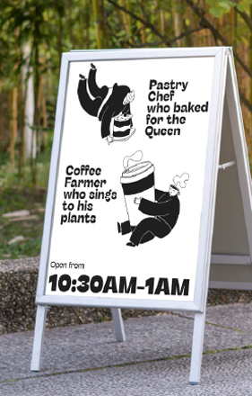
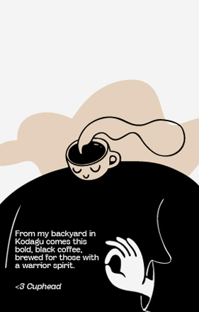
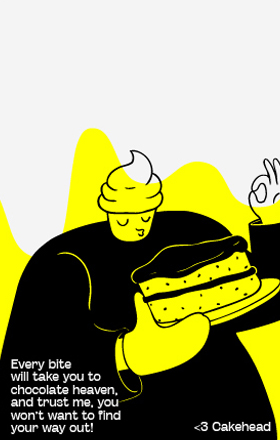
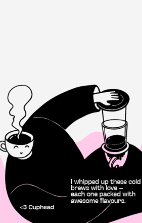
Cakehead and Cuphead — the brand mascots of P.U. Dingding, represent the two co-founders with polar-opposite personalities. Cakehead is a globe-trotting, extroverted pastry chef with a gift of gab. He’ll tell you all about the tea parties he’s hosted for the Queen, desserts he’s crafted for the BAFTA dinner, or how he’s buddies with Brian Lara. Cuphead, on the other hand, is the opposite—a quiet coffee farmer from Kodagu who thrives in nature and enjoys his own company, literally serenading and sensing plants and animals. What they have in common is their culinary passion and a lust for life.
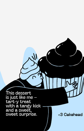
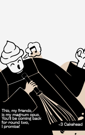
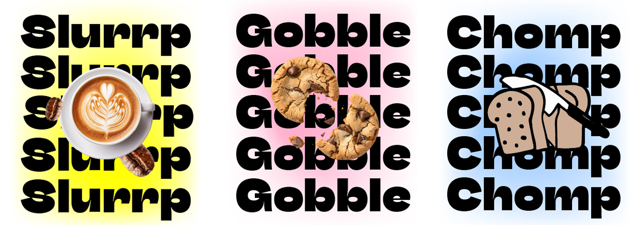
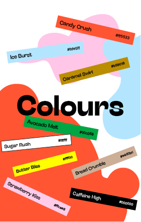
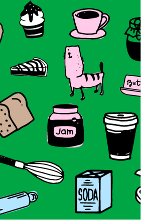
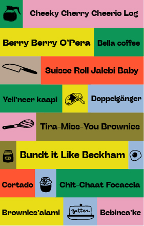
We gave P.U. Dingding a personality that’s bold, playful and cantankerous, and planted in popular culture. Visually the dynamic identity comprises of many parts — illustrated mascots, whimsical doodle-icons of cafe and bakery tools, spill-&-drip motifs that mimicked icing, froth and drizzle— paired with loud layouts and drool-bait imagery, and a bank of remixed song lyrics with fun puns. Sitting contrary in this sugar-free, diet-watching era of restraint, P.U. Dingding champions indulgence. The brand is always coaxing you to jam and binge.
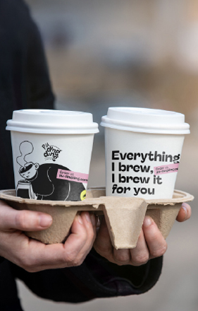
P.U. Dingding’s first shop-in-shop format at Kaavu, Whitefield, is fast becoming a cultural hub. Its instagram page is turning into a foodie community. More than just coffee and cake, the cafe is earning brand love for its generous servings of nostalgia, connection and a reason to smile.
In fact, fans are so smitten with the brand identity, they’re asking for merchandise to take home! Thanks to the success of the launch, P.U. Dingding is all set to level up, with standalone stores and celebration cakes planned in the next 2 years.